 San Serif")

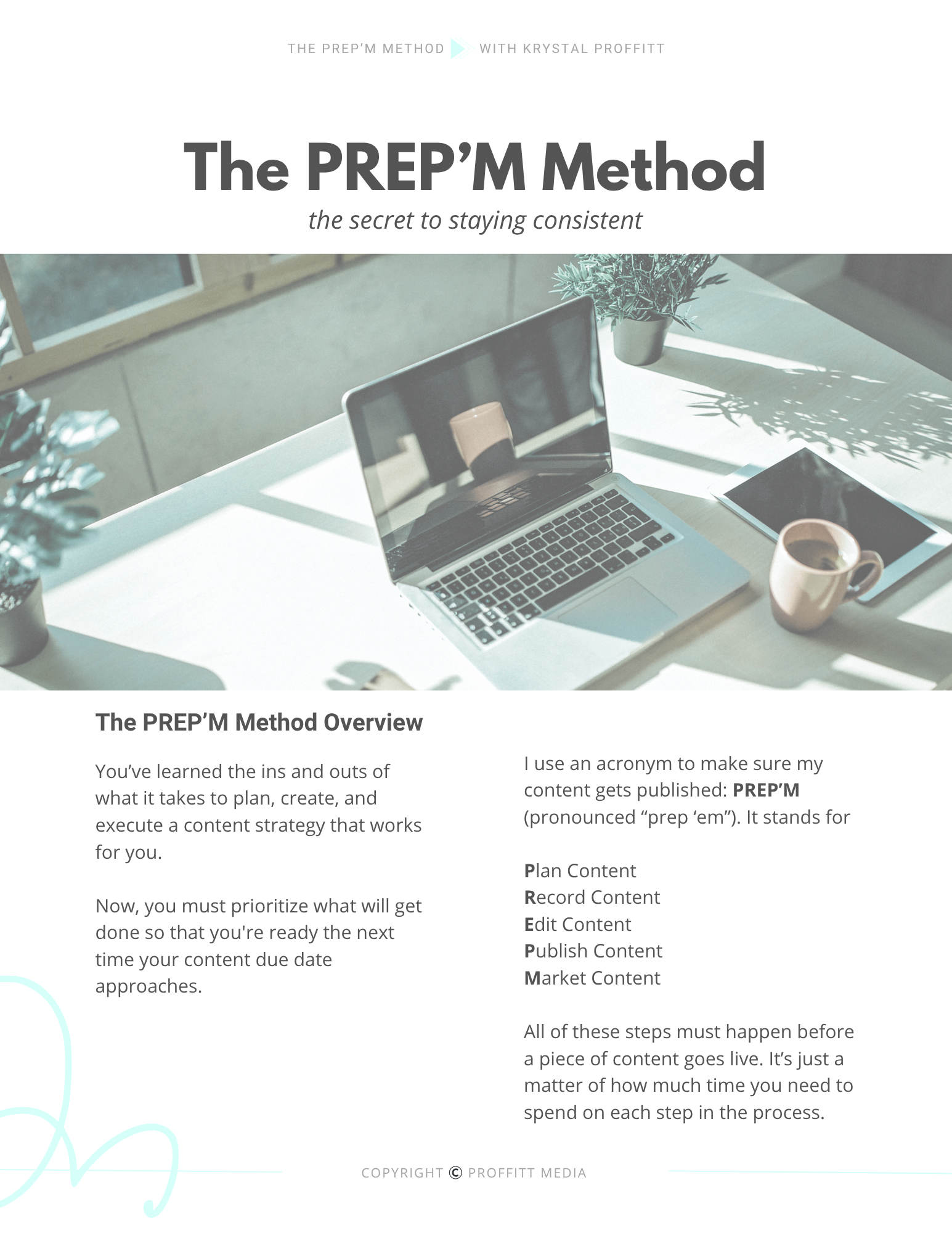
WHAT’S THIS EPISODE ABOUT?
I often get asked questions about podcast artwork (aka the podcast logo). Things like,
Do I need to have my picture on the cover?
Does it need to be a stock image?
Do I need to include my first and last name?
Do I need to have the entire title?
What should be in the background?
How big should the text be?
All of those plus more are what we are talking about here today for podcast artwork and what you need to know. But first, I want to dig deep into the info you need to know about your podcast title.
Podcast Title
Before we dive too deep into the Podcast Title for your podcast artwork, I want to remind you that we did an episode recently about “Naming your Podcast”. If you haven’t named your podcast yet, check out that episode here.
Okay, let’s get into what information to have on your podcast artwork.
There are 3 really important takeaways that I want to make sure hit home when it comes to the Podcast Title on the image you’re going to use for the podcast.
Let’s dive a little bit deeper into each one of these:
-
Don’t add too much text!
- I look at podcast images all the time! Whether it’s marketing materials, logos, artwork, graphics, you name it… I am constantly looking at podcast images. And where I see so many people go wrong is they tried to shove way too much text onto an image. the overall message is less is more!
- If your title is too long, only put some of it on your artwork.
-
Make sure the image and text look good really big and really small.
- There are specific requirements for images you use for your podcast artwork. This is why it is so important to make sure the text you use – whether that be the title of your podcast, your name, or any other information you have on the image – look great no matter the size or dimensions.
-
Stay up-to-date with the latest requirements.
- You can check out the latest requirements for Apple Podcasts here.
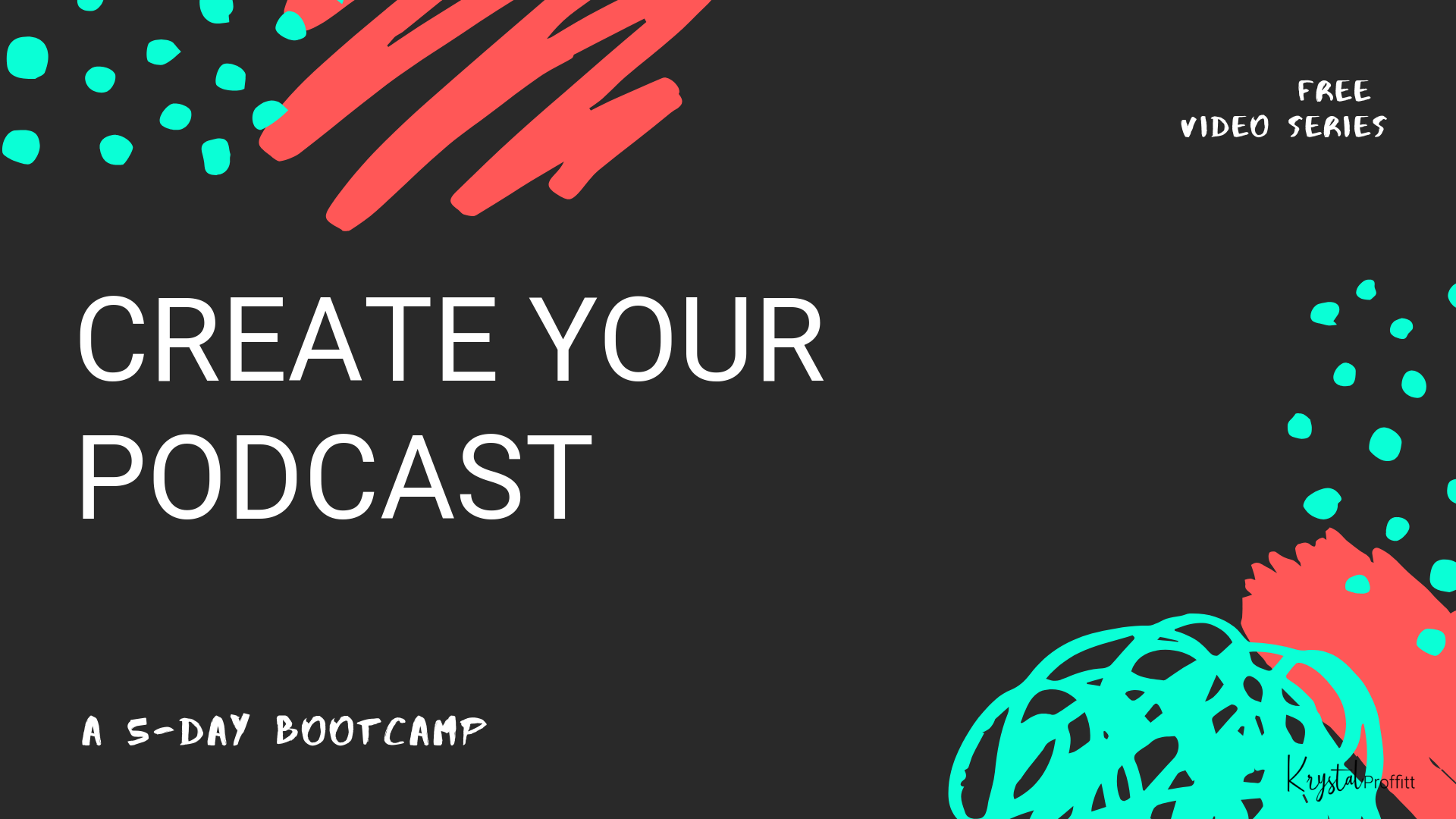
Joined the Bootcamp Yet?
This is our FREE 5-day Podcast Video Series that walks you through the basics of podcasting!
Podcast Picture
Do I use a picture of myself?
Do I use a stock image?
What colors need to be on my logo?
Does it need to be professionally designed?
Does it need to be an animated picture?
These are the questions I see you most often when it comes to the actual image people use for their podcast.
And my answer is always the same, “It depends…”
I know, I know.
That’s not the answer you’re looking for.
But at the end of the day YOU are the only one that can determine what is going to work best for your audience.
My suggestion is to ask better questions:
What does your audience want to see?
How do you want listeners to feel when they see your logo?
Do you want people to feel excited, motivated, confident, or energized?
These are all the things I ask myself, my students, and my clients when talking about podcast artwork. If you are dependent on people finding your podcast through search on Google or podcast platforms, then you better make sure that your podcast artwork stands out!
If you are hoping people recognize your face and stop their scroll to check out your podcast, then go with your on picture for the cover.
If you just want to convey a very simple message with your logo, then do that.
I’m not going to tell you there is a strategic formula or a one-size-fits-all approach for podcast artwork because there isn’t. Only you will know what is going to work best for you and your audience.
A few suggestions for crafting your podcast artwork.
- Include your brand colors & fonts.
- We’ll talk more about that and an upcoming “Branding” episode.
- Choose an image that isn’t used everywhere else.
- Be really careful with stock photos and do your research within your genre or category to make sure someone isn’t already used that exact same image. I know that should go without saying, but you’d be surprised how often I see the exact same stock image used over and over and over again in different ways.
- As a consumer of a lot of online content, it makes me cringe when I see the same picture being recycled in multiple different places. Do your research and make sure that your image stands out from others in your category.
- Stay true to your message and who you are.
- You can always change your podcast logo or artwork later, but don’t get hung up thinking that it has to be perfect.
- Hire someone to create it for you if the idea of design totally overwhelms you!
RECAP: Podcast Artwork – What You Need to Know
- Podcast Title
- Podcast Image
Links Mentioned in This Episode:
- “How to Name Your Podcast” Episode
- BuzzSprout Podcast Artwork Suggestions
- Apple Podcast Requirements
- Canva.com
- Proffitt Podcast Online Community Facebook Group
- Podcast YouTube Channel
- Resource Library
- 5-Day Podcast Bootcamp

")


_San_Serif[1]")
Comments +